Статья
Packaging Design
08/20/2011
Summer is the time for everything light, vitamins, fruit, vegetables, cereals, light salads, fruit cocktails, and fresh juices. We spoke to our illustrators and colleagues about food and beverage packaging design, its value and the creative process behind.
Summer is the time for everything light, vitamins, fruit, vegetables, cereals, light salads, fruit cocktails, and fresh juices. We spoke to our illustrators and colleagues about food and beverage packaging design, its value and the creative process behind.
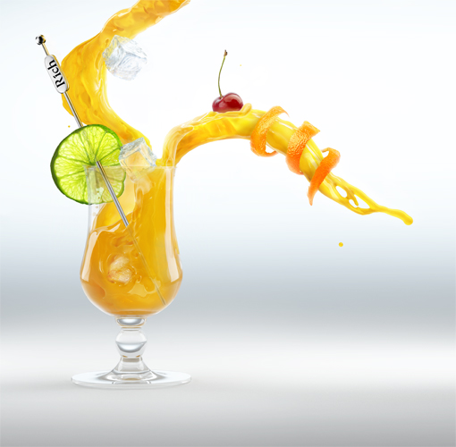
Illustrator: Ruslan Baranauskas commissioned by Propaganda Ogilvy for Rich
On packaging.
Ilya Mikhailov, Art Director at Art. Lebedev Studio: There isn’t yet a conventional rule as to how boost sales of a product through its packaging design. The only thing we can speak about is “adequacy” meaning that it should correspond not only with the product, but also with the target audience, retail environment, budget, goals, etc.
At least three people are needed to create a classic packaging design: a designer (in most cases he/she does the layout as well), a type designer, and an illustrator (needless to say, they work together with a bunch of others, including creative and art directors, an editor, a photographer, a manager, a packaging engineer, etc.)
At the end of the day, the resulting design looks good.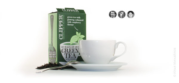
Just to have this handsome box on my kitchen shelf, I’m ready to go an extra mile to drop by an over-priced store.
And a similar result is fairly achievable without the specially designed typeface or commissioned illustration.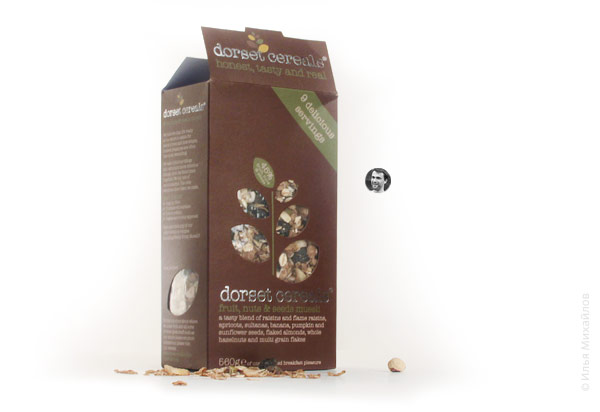
Even without a designer (however, this is a different kind of packaging—for fresh-made, perishable or cheap products).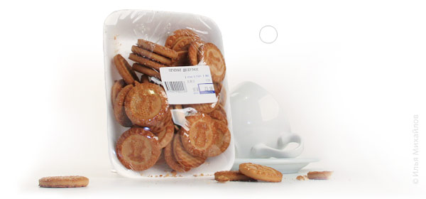
Such simple design, of course, won’t work for everyone, but that probably has more to do with the particular short-shelf-life products segment. Most of the convenience store customers are loyal to packaging that catches their eye. Loud design, often seemingly tacky, requires thought-out and painstaking effort of a huge team of artists and designers.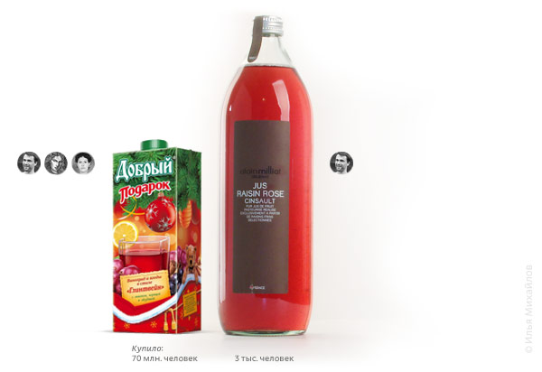
From time to time, it comes out nice and tidy.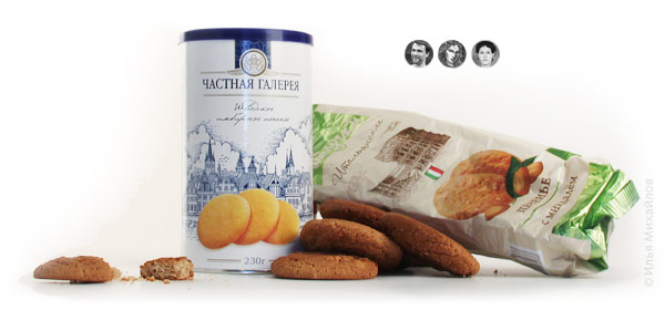
Busy moms pushing their carts don’t care all that much about a font mismatched against the engraved background, or an illustration on the box looking somewhat different from what’s inside.
Moreover, in some cases people make a decision to purchase something without even looking at its packaging. In this case, the designer should fight any decorative urges, choose the least time-consuming solution and save the enthusiasm for later.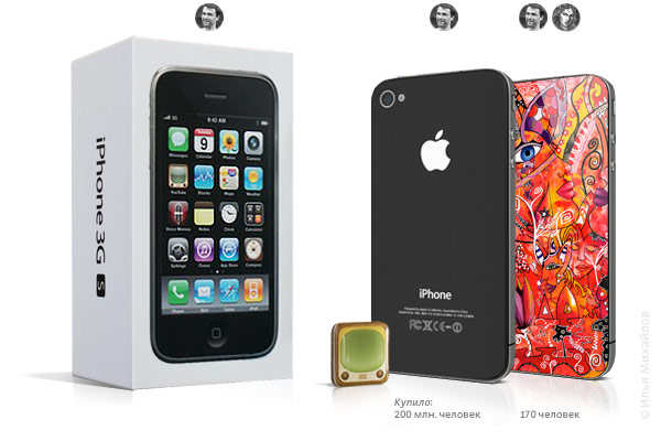
By the way, this is a good example of how a neutral design (the phone body as it is) wins over a customized piece in the long run being cheaper to produce. For the phone the former works better.
Design with gusto! :-)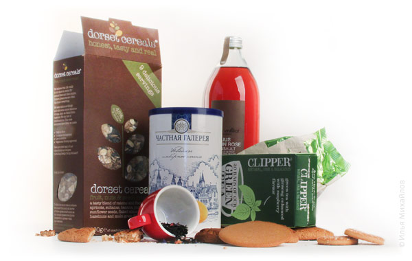
Alexander Zavatsky, Art Director at Boroda Project Ideas Company: Design and illustration should solve a particular task without affecting the actual product. It is good design that makes customers pick products and put them into their shopping cart. People will always buy visually appealing goods; the question of quality comes later, beautiful packaging is always something you’d like to keep, as an artwork or simply as a nice reference piece. Everyone appreciates well-designed things.
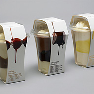
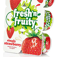
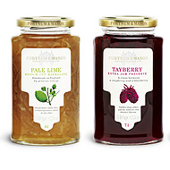
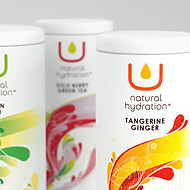
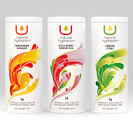
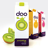
Alexander Zavatsky’s choice of good packaging designs
What’s your idea of packaging design that sells?
Aram Mirzoyants, ex-Art Director at Depot WPF: Before answering this question, let’s agree on which market it’s meant for—Russia, Europe, the US or Asia? Each of these has its own dramatically different visual image. Surely the information is perceived in a similar way, but the local flavors and emotions are absolutely different!
A packaging design that sells should correspond perfectly with how the product is positioned in order to attract customers’ attention most effectively, and with the target audience, of course, so that it causes no discomfort, nor breaks any cherished conventions. And yes, without addressing emotions, making an impact, it’s nearly impossible to succeed.
Generally speaking, for me all products fall into two categories: mass market and everything else. Mass market includes low- to mid-priced goods, something that the majority can afford (which they do on a highly regular basis). This is the most competitive market. Every year several thousand new products arrive, to last no more than three years on average.
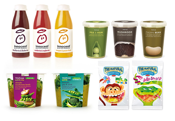
Aram’s choice of good packaging designs
Naturally, whether a design sells depends on many things, such as the strength of the brand (recognizability/trust), pricing, design, merchandising effort, customer experience, etc. Let’s focus on packaging design and take a look at its basic components:
- a brand logo;
- an image of the product (photograph or illustration) to speak to customers’ emotions;
- an accompanying text explaining the product to complete the composition.
For the mass market products, the visually appealing image of the product is essential. You’ll understand me better if you compare just an orange, and a juicy orange.
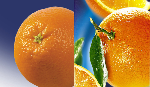
Feel the difference?
Vladimir Shreyder, Art Director at Look At Me: A design should stand out, appeal and deliver a clear message, created knowing that it’s required not so much for the product itself, but for the emotions, ideas and other abstract matters embodied in the consumer goods on store shelves. Vladimir Vysotsky’s records were once selling well abroad thanks to the naked girl on the cover—apply the same to a bottle of oil, and the effect might be as positive.
Would you buy a product without an illustration on the package?
Aram Mirzoyants: I might, however it’s often the case of premium goods, which is a totally different story :) Of course, a beautiful delicious illustration or a professional quality photo of the product could encourage me to buy, for example, juice. You can’t deceive your subconscious mind—what looks fresh must be juicy and tasty, even though the carton often contains artificial junk :)
Vladimir Shreyder: Probably yes, if it gave a perfectly clear idea of the product, but given today’s abundance of goods something like that would be difficult to remember. Some of you may recall Artemy Lebedev’s failed attempt to deliver an original and stylish box design for Vernost Kachestvu chocolates, whose sales plunged, because it didn’t have a bright illustration. Would Alyonka chocolate bar ever become legendary if it wasn’t for the illustration?
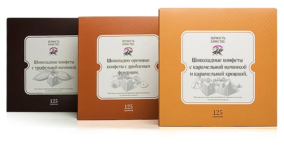
Vernost Kachestvu chocolate boxes
Could a brilliant illustration/photograph of a fruit make you buy juice, for example?
Vladimir Shreyder: Buying something today, consumers don’t get a product alone, but their part in an exciting story as well, and what this story is about couldn’t depend less on the contents of the package. A brilliant example for me is the project by Russian (!) designers—original black and white milk cartons with rustic looks done in pencil, which gives them a hand-made feel, simply amazing. Or Coca-Cola, for instance, already perfectly familiar to each and everyone, regularly commissions illustrations for their limited editions—even though the very same coke in a regular bottle costs way cheaper, many still want the special packaging, as it contains much more than a soft drink.
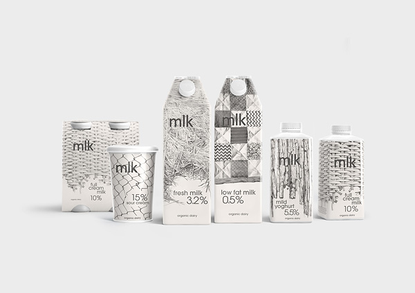
MLK brand by Depot WPF was awarded the only Russia’s Silver Cannes Lions Award. Designer: Aram Mirzonyants.
How long does it take to paint fruit for a package?
Tatiana Vaskovskaya: It depends on the final size. A sketch takes a couple of hours. To complete a hi-res I would need several days.
Natalia Savinykh: Depending on its complexity and format. On average, a print-ready piece takes about a week.
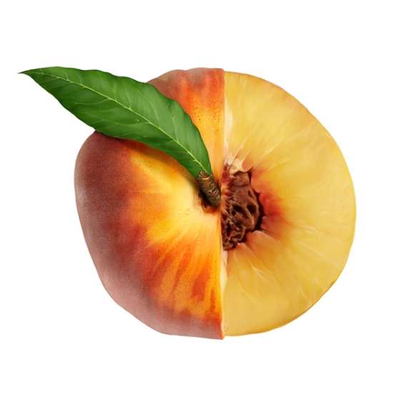
Illustrator: Natalia Savinykh
Could you take us step-by-step through the process?
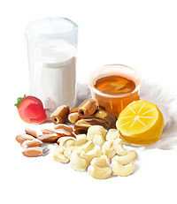
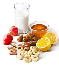
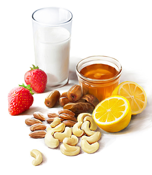
Tatiana Vaskovskaya: Living back in the 19th century, or at least in the middle of the twentieth, I would go to the market and buy fresh fruit. I would arrange them nicely on a table in my workshop, take out a canvas and slowly, with gusto paint a still life, taking a week or two to complete it, relying on inspiration ))) We cannot afford such a luxury these days, for there are always deadlines and too little time. But the principle hasn’t changed—to create a realistic image, you should draw and paint from life. Photographs, from your own stock or found online, are frequent substitutes. I spent about 30 minutes collecting the materials—cashew and almond nuts, dates, and honey jars. Strawberries and milk I’ve painted thousands of times, so those I could do from memory.
In this case the design brief was very general—here’s a recipe, you may paint whatever you wish :) So first I checked to see a professional approach—I went through stock photos to find some good references. I chose what I’d liked most—a still-life as seen somewhat from above. This step is often omitted, because as a rule art directors send cucumbers and sketches showing approximate composition.
|
1. A few pencil sketches to find the best way to arrange the ingredients. |
2. A color sketch with nearly solid fills—grayish white milk, red strawberries, honey of gold. Checking the balance in the composition. |
3. Adding volume, fixing composition again, continuously until the very end. Rotating and reflecting the image from time to time helps to make sure nothing sticks out or looks too heavy. |
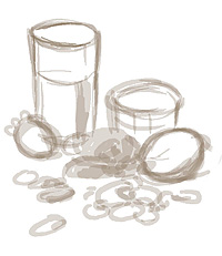 |
 |
 |
4. Details and geometric shapes (ovals and circles) complete. Done!
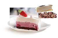
Natalia Savinykh: For our cake we are going to need a texture, which we can find online or photograph, and a plate.
|
1. Plate found. Getting rid of the background. It’s best, of course, to take a picture of the plate from the right angle and in the right light. |
2. Adding a drop shadow. |
3. Now the cake itself. Selecting and arranging the textures. |
 |
 |
 |
|
4. Connecting the pieces together. It’s not easy to make it look natural—the layers should have realistically imperfect edges. |
5. Elaborating the drop shadows cast by the plate and the piece of cake. |
|
 |
 |
6. The lighting fixed, and that’s it.
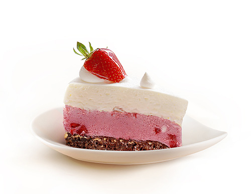
What’s important to remember when drawing or painting fruit and vegetables?
Tatiana Vaskovskaya: If you need to paint a single fruit or vegetable, go ahead and take pictures. Advertising and packaging require visual perfection, which is rarely found in real life. So if you are going to paint an apple, buy a dozen of them, and shoot them from different angles. Using fragments of the shots, you can create a photofit of a perfect apple—a nice red side from this one, a stem from that one, and a brilliant droplet from yet another one. This flawless apple is what you should then paint. What tools and techniques to use is up to you. I know illustrators skillful enough to do this in vector :)
Compositions are more difficult. I’ve described the general process above.
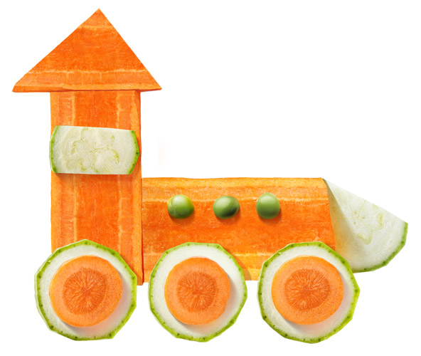
Illustrator Natalia Savinykh commissioned by Bazina.Sass+ for Nutricia
Light and shadow are always important. If you can’t paint a simple ball, you won’t be able to create a lifelike peach.
The second thing to remember is texture. Nothing looks delicious unless it has the right texture. It is very difficult to paint such popular and common things as strawberries and oranges. Both have distinctive and very fine textures, requiring much effort. And without its peel, an orange is just an orange ball. I’ve made my own collection of various textures. I take pictures, scan images, search online. I use them occasionally—I simply ‘pull’ the one I need over a ready-drawn object.
It is also a good idea to test your work on someone, for example, to show it to your mom asking what she thinks it is. Sometimes, you’ll find the answers surprising. And if your plum doesn’t look like a plum to an ordinary person (and a kiwi is something else :)), you should try again. Fruit and vegetables are not the kind of things you can be stubborn about, telling people that’s how you see them.
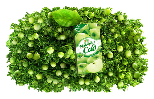
Illustrator: Ruslan Baranauskas commissioned by BBDO for Fruktovy Sad
Natalia Savinykh: The most important about fruit is their special texture. Without it, however beautiful your image is, it can’t look natural. Every fruit has its own peculiar texture, so you should carefully study real fruit. In order to make a texture more vivid, I zoom in to twice the final size. This allows me to focus on the smallest details and, once zoomed back out, achieve a very elaborate look.
Contents of the package — the most important.
Olga Malysheva, founder of Salat Shop blog: Summer is a great time for shopping at fruit and vegetable markets, where it’s never about packaging design, but about who is the nicest and offers the best berries. While at convenience stores, in Europe in particular, the design often influences your choice. A smart slogan, a pretty box, a cute illustration, or an intricate design all seem to work well on me. But as I’m rather picky about what I eat, the contents of the package remain the most important thing. During the summer, I tend to buy a lot of greenery, vegetables, fruit and berries.
Olga created a special summer cake recipe for our readers.