Статья
Soviet movie poster
05/27/2014
It took surprisingly much talent and lots of efforts to create an object of graphic arts which had two months to live at most. What is more, the artist had to meet such deadlines like to have the work finished by the next day morning after he has watched the movie in the afternoon. But neither transience nor haste prevented this genre from contributing to the history of the Soviet avant-garde.
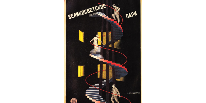
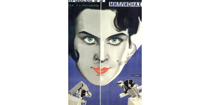
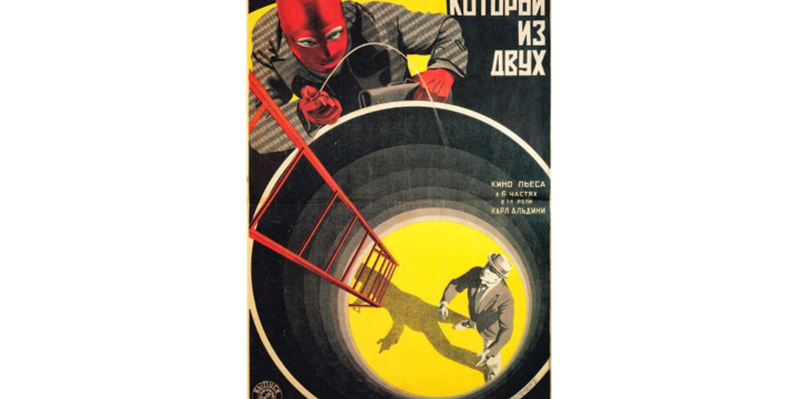
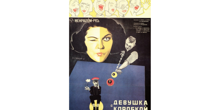
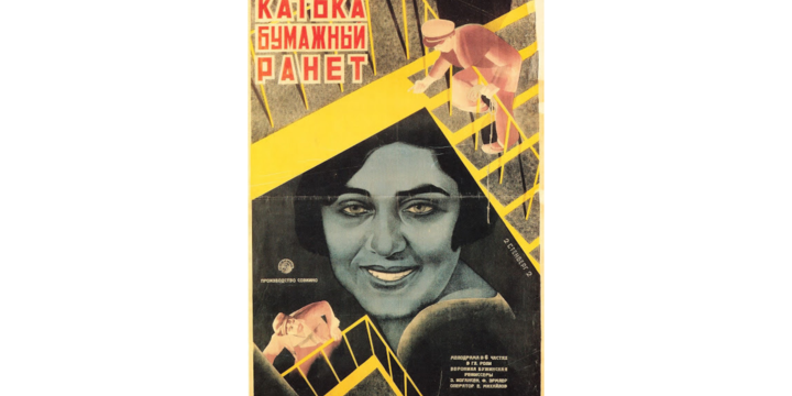
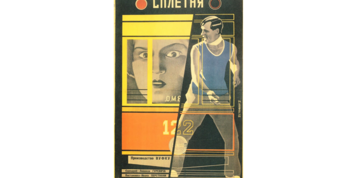
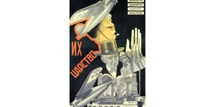
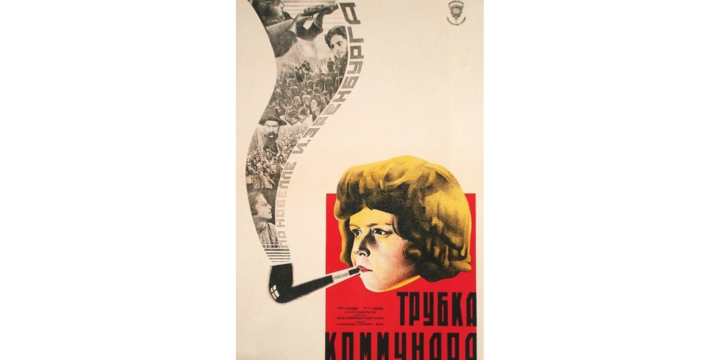
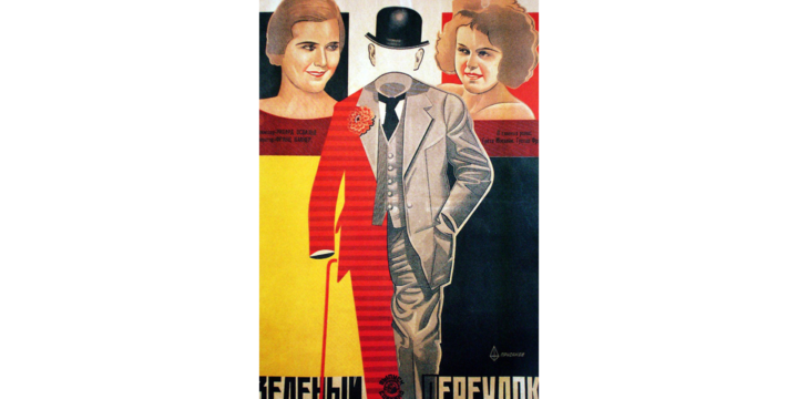
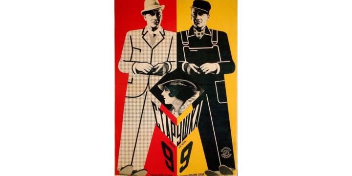
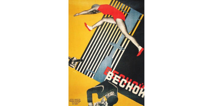
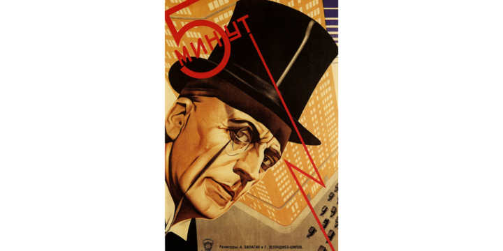
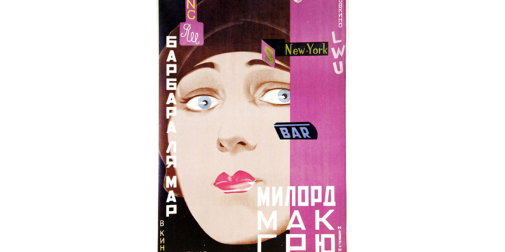
1920s and early 1930s are considered to be the most important and interesting period of the Soviet movie posters époque. There used to be a special department that dealt with the posters for movie distribution. Many famous artists of that time worked there, for example, famous Stenberg brothers, whose posters one can recognize by the signature “2 Stenberg 2”.

The knowledge of lithography helped make the picture better, and many other things were created by the artists to reproduce the photography and improve the quality of the poster in the teeth of bad printing techniques. That’s why Stenbergs’ works differed from the others technically as well as aesthetically.
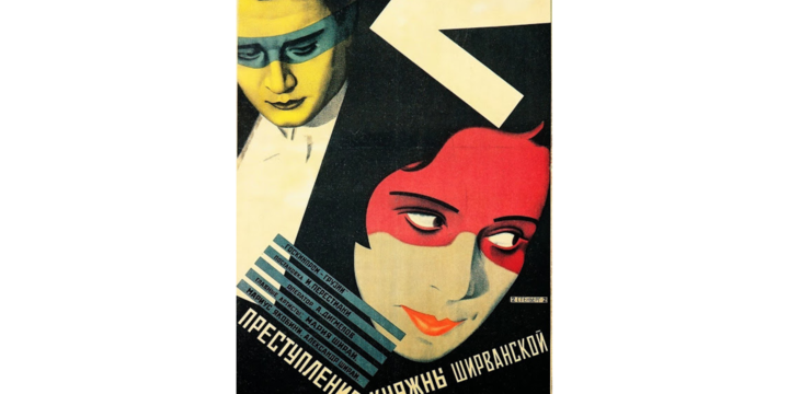
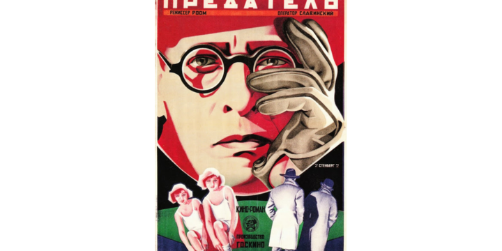
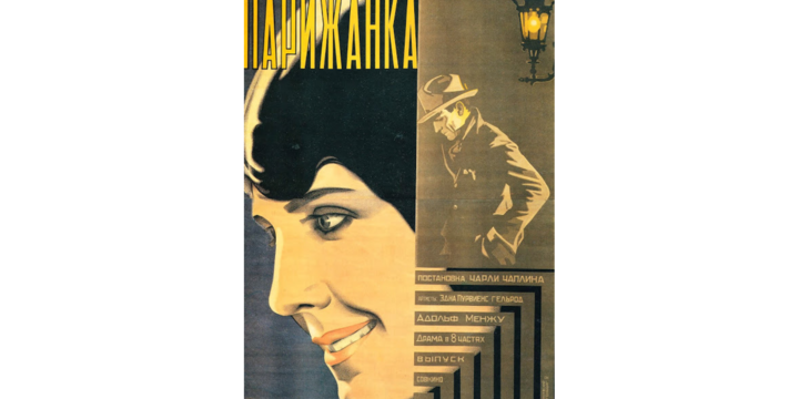
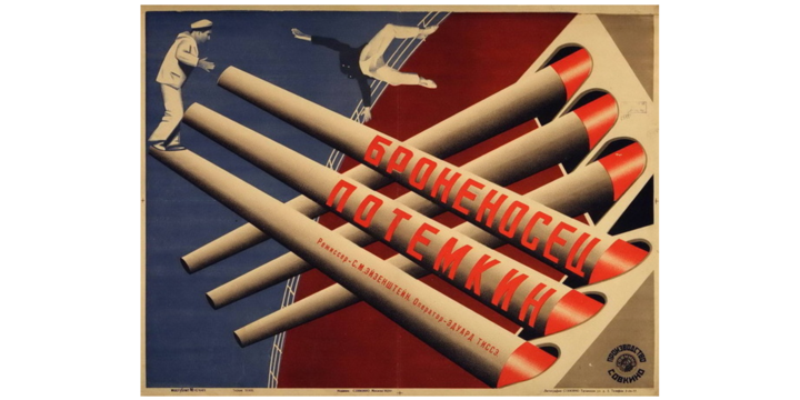
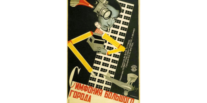
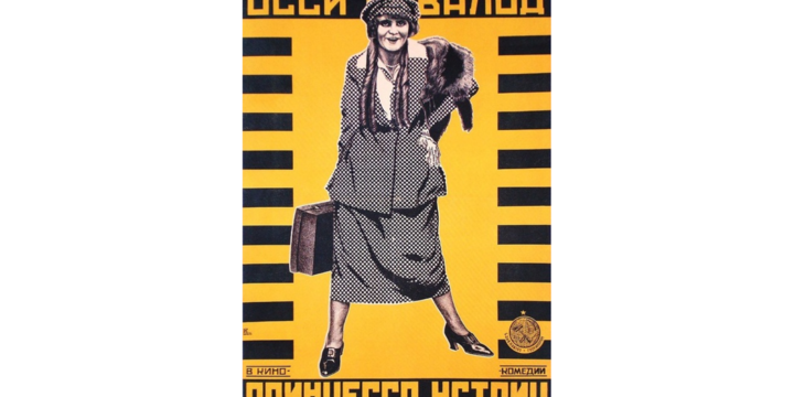
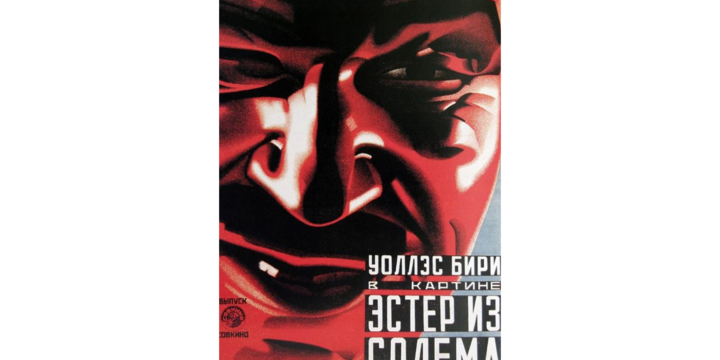
Almost all the early posters were made for foreign movies, which could not help influencing their style. However, their own constructivist manner is recognized in the pictures for the first Soviet movies (for example, the poster for “Battleship Potemkin”).
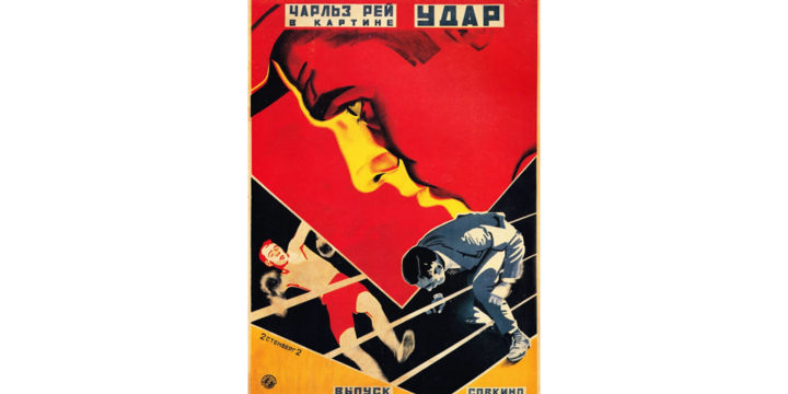
The most important thing about Stenbergs’ works is their love for symmetry and an amazing sense of perspective. They were always experimenting with the posters: “In our work we use every possible method to stop even a passer-by in a hurry”.

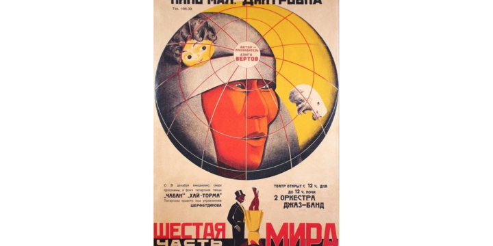
But the top artist in the genre of Soviet constructivism is Alexander Rodchenko. He hasn’t made many posters himself, but his unique experiments in photography and graphics have greatly influenced the traditional Soviet movie posters. But it’s not just art school that made a movie poster a high genre. The artists worked with such talented people as Sergey Eisenstein, Dziga Vetrov and Alexander Dovzhenko.
In the 20s of the 19th century everything connected with the cinema making business wasn’t paralyzed by the Soviet censorship, so the posters were comparatively ideology free. The most horrible thing to happen later was the lack of creativity freedom and its substitution by a set of ideologically safe clichés that set the teeth of both authors and viewers on edge.
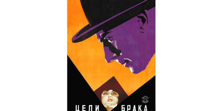
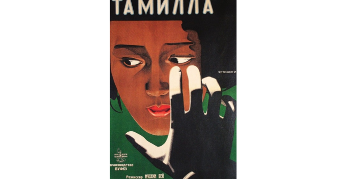
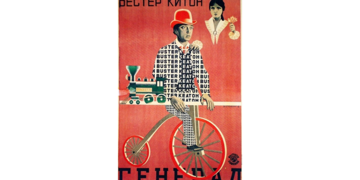
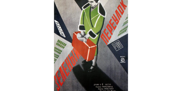
One of the first boons of avant-garde artists was the refusal of the obligatory portraits of the characters. It’s likely that the artists got too tired of depicting the same faces. Another important element was the famous constructivist typography that greatly influenced the development of the poster genre in our country.
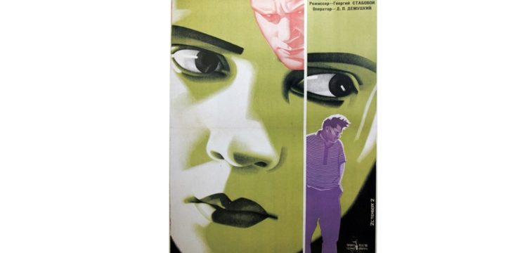
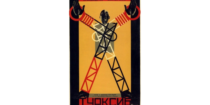
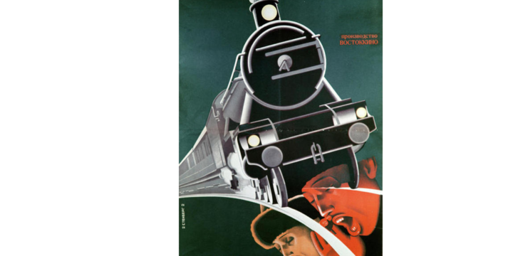
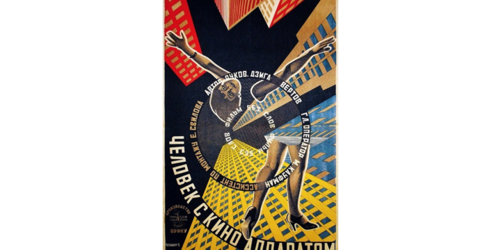
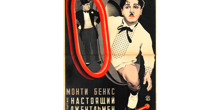
Speaking about composition, designers liked imitating the techniques from the movies of that time: distortion, non-standard angles of lighting etc. Collage has become very widespread in the industry.
Another factor of freedom was the possibility to choose the color palette. In the era of monochrome movies it was the artist who decided on the color of the picture which would be transmitted to the viewers. And they didn’t limit themselves: one can see the variety and courage in the posters of the 1920s, although the graphics of that period was very precise about colors.
What is more, there were plenty of other factors that made that period of time and the place the most appropriate for the advent of impressive poster tradition. Unfortunately, that time was followed by the époque of graphic stagnation, when young and talented artists got lost in the grey dull background. But the Soviet tradition of movie poster wasn’t lost, it just moved abroad where it helped many other poster schools develop and inspired lots of talented designers and artists.