Статья
Retrofuturism
02/15/2022
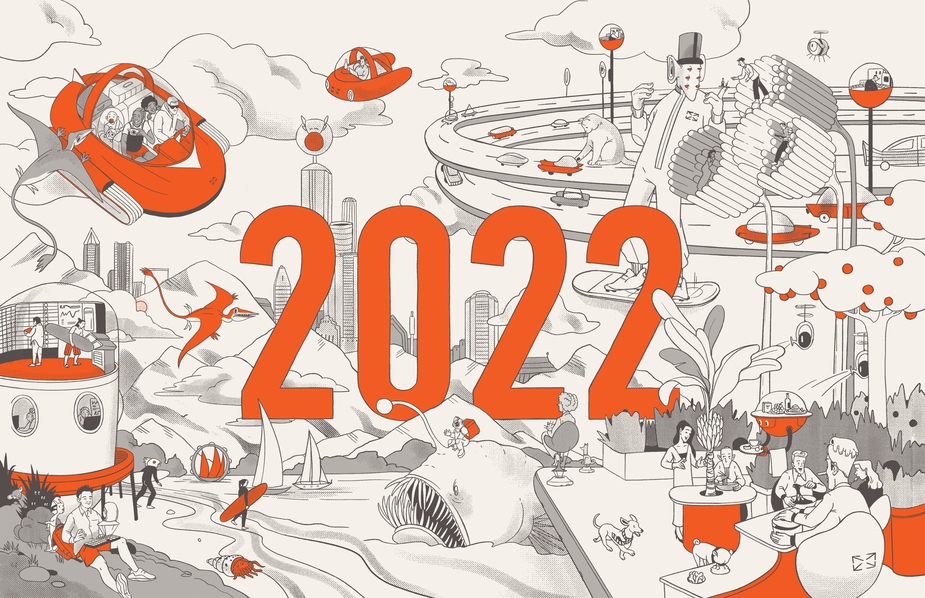
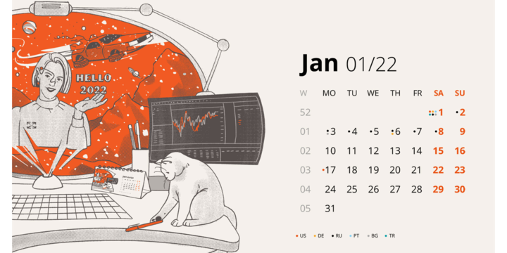
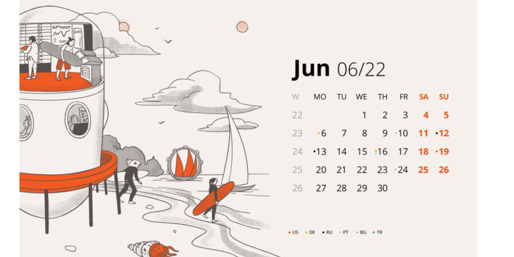
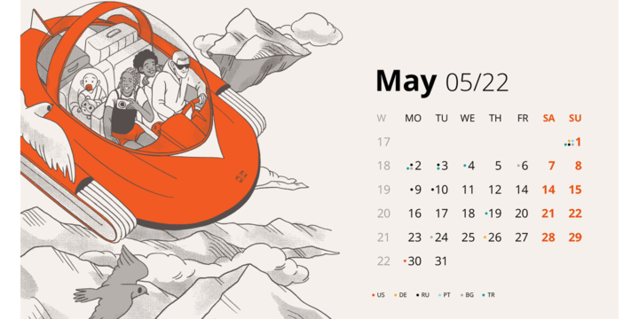
Illustrations for calendars is a typical seasonal task for us, especially around New Year’s, but that makes us like them even more.This time we made a calendar for Devexperts for 2022 with a full immersion in the technological future!
Devexperts came to us with a detailed brief: theme, story sketches for illustrations, even a small pool of agency residents, that in their opinion could be a good fit for the project based on their styles. Of all the selected artists, Katya Murysina was chosen as the project illustrator.
In the process of making illustrations it was important to use the branded orange color – Pantone 1665. Everything else was up to the illustrator's creativity.
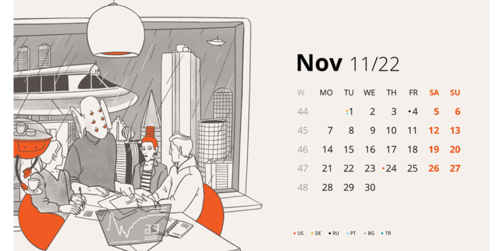
Katya worked on several different sketches at the same time, to improve speed. Even though there was enough time to work on the project, she wanted to spend as much time on details as possible. It was also important to logically split themes between months, so the calendar looked consistent. On top of that, we decided to alternate close and distant plans in illustrations to highlight each picture while looking through pages.
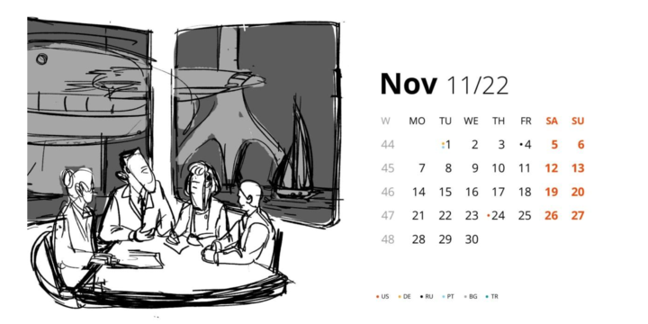
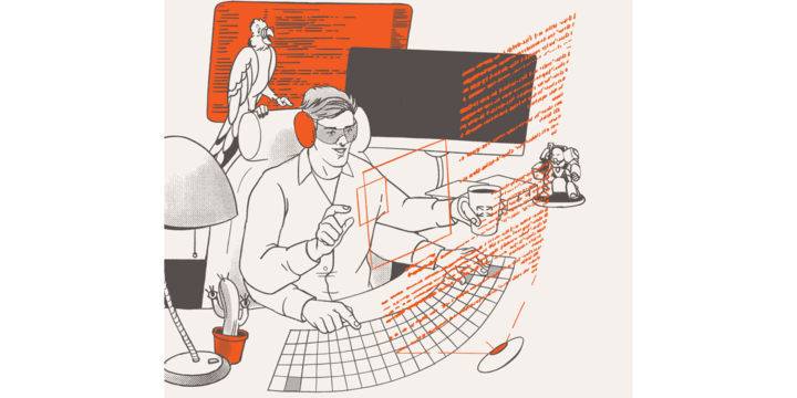
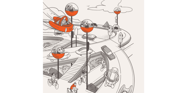
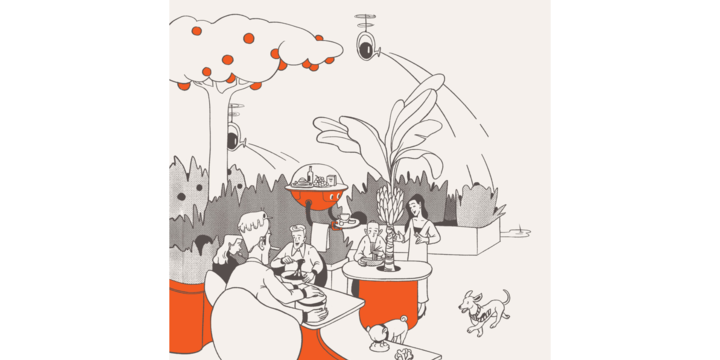
Katya Murysina was mostly inspired by retrofuturism and 60-s magazine «Popular mechanics»: «The company sent me a list of themes they came up with during brainstorming: an underwater office, virtual office, client meeting, future canteen and much more. Out of those suggestions I chose personal favorites and started thinking on their visualization. The plots were splitted between months. For example, in May people tend to relax more, that’s why the illustration represents a vacation. December is all about corporate parties, so characters in that picture invite viewers to end the year and celebrate with them.
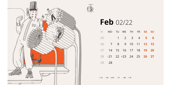
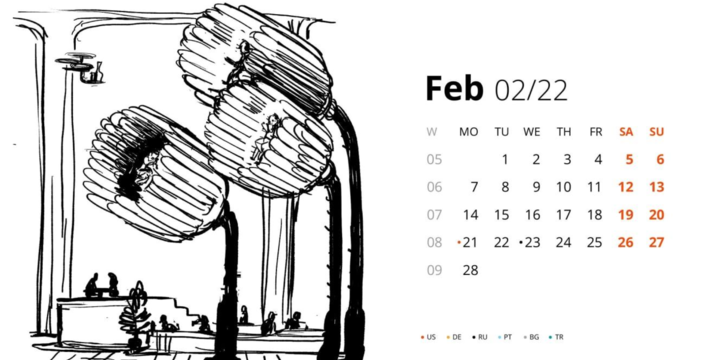
In order for the project to look put together, I came up with a consistent logic of this futuristic world, that combines technologies and harmony with nature and animals. There are also details that travel within illustrations and unite them – a six-eyed giant and voluminous holograms. Some of the times my sister, who is a programmer, assisted me on details that could be added for a more realistic story.
All of the illustrations resulted from my imagination: I took familiar situations and in my mind converted their logic into this fictional world. Plus, I had several visual tricks running through my mind I never had the chance to use in projects until now. But when you have to come up with 12 different situations in a limited amount of time, you have no choice but to experiment.
My favorite illustration has got to be a situation in the canteen. I had a lot of fun working on those characters. I am happy with every plot from the calendar – the ease of chosen illustration technique has let me take more time on working with details, composition and characters, so every illustration turned out well-thought through».
Send us your requests, and we promise to make your company a calendar for an upcoming year in any style: from retrofuturism to paper illustration!