Статья
On your side
12/29/2021
This project was different from anything we have ever done – this time we made an illustration guidebook for one of the largest Russian telecommunication company «beeline». Now it is time to share our experience.
For the first time in 16 years «beeline» rebranded in order to tell its customers about positive changes within the company and its products and services. The development of the updated strategy and visual identity was carried out by the Contrapunto agency, who asked us to create an illustration guidebook. This was an unusual task for us, usually done by branding agencies. Nonetheless, our expertise in illustrations is very high, so we were up for a challenge.
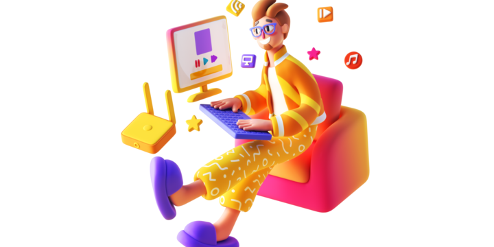
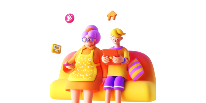
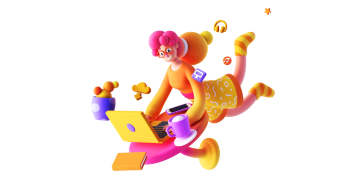
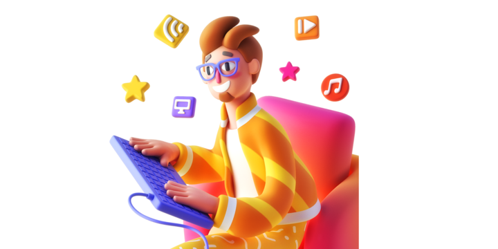
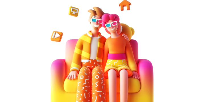
Guidebook represents a set of rules for creating an illustration and a list of needed components. Firstly we had to come up with an illustration style. Consumer, in this case, doesn't just need to be entertained by the brand, rather wants it to share problems and be provided with unique solutions. That is why in the center of the renewed «beeline» brand is a regular person with its character, concerns, and needs. «On your side», – the new company slogan represents the will to make communication with clients more human-like. This has also become our starting point in the brief, so we analyzed popular illustration styles used by brands and settled on 3D with its soft and rounded shapes.
After presenting sketches from certain illustrators, it was decided to transfer the creation of a new concept for «beeline’s» illustrations to Alina Balgimbaeva. She was able to create curved and flexible limbs for characters that look relaxed and comfortable.
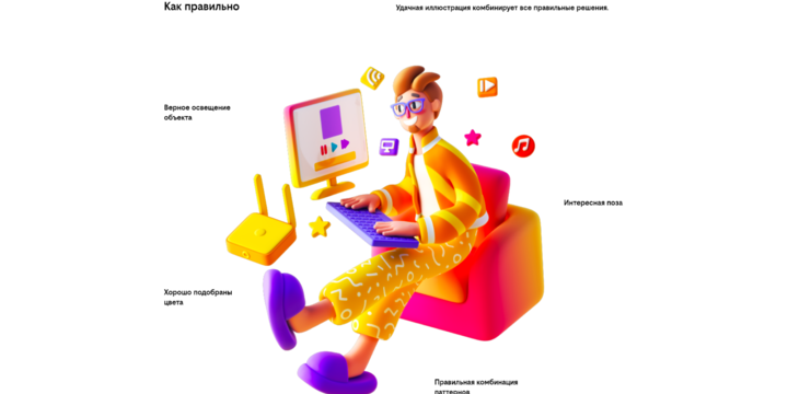
The expressiveness of new illustrations is based on five principles: comfort, meaning giving up angles in order to achieve more soft lines; lightness – all of the characters are floating in the air; optimistic, where bright colors are nicely blended; open-mindedness, which is represented by details and general lightning; humanity – focus on a character, who is in the center of the scene.
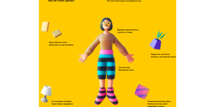
If you look closely into the character's and object’s texture, you can notice that it is the same everywhere – soft, mate. All of those characteristics are considered in the guidebook: lightning, color palette, patterns, characters anatomy, gestures, accessories. For further instructions, we made wrong examples to explain what can be improved.
There were slight difficulties with the color palette. Firstly we adopted all of the illustrations for the yellow background. But because we didn’t want any strong associations with the brand's previous identity, the background color was changed to white, so that final illustrations were less contrast in terms of color and overall seemed more aesthetically pleasing.
«This is a completely new experience for the agency. It definitely took us to a whole new level. Feels good to realize that clients trust our decisions, they are sure of the result. We are also proud that the guidebook looks like a complete product, rather than just an instruction for designers, and can be used in promotion,» – summed up project manager Dmitry Sazonov.