Статья
A few words about lettering
03/28/2014
If font is a universal designer's tool but lettering is just one-off art object. That is why it often becomes so-called backwater for illustrators not for font designers. So, general practice demonstrates a wonderful thing that painters are fond of letters no less than type-designers. Their ardent love is able to atone a lack of pedantry via imagination and passion.
If font is a universal designer's tool but lettering is just one-off art object. That is why it often becomes so-called backwater for illustrators not for font designers. So, general practice demonstrates a wonderful thing that painters are fond of letters no less than type-designers. Their ardent love is able to atone a lack of pedantry via imagination and passion.
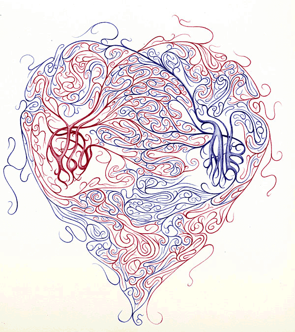
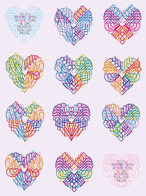
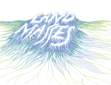
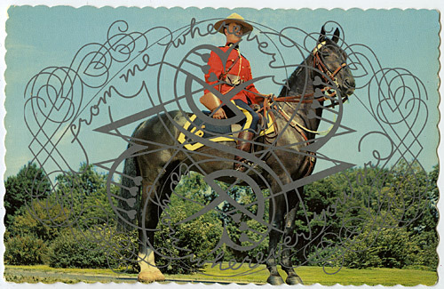
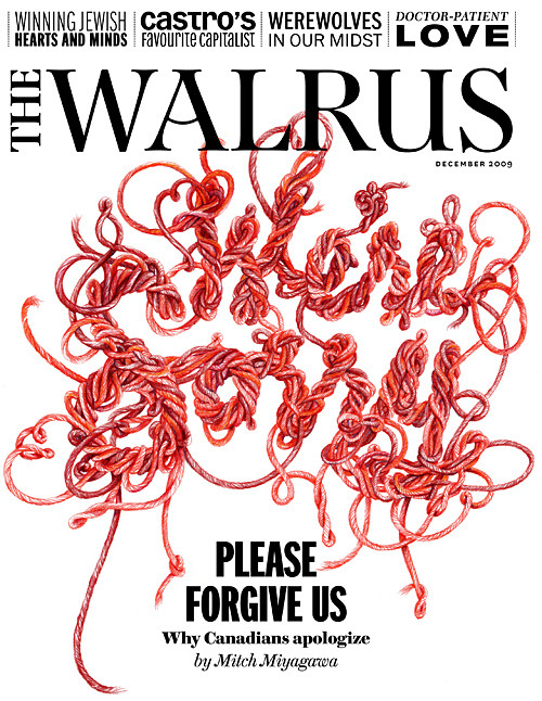
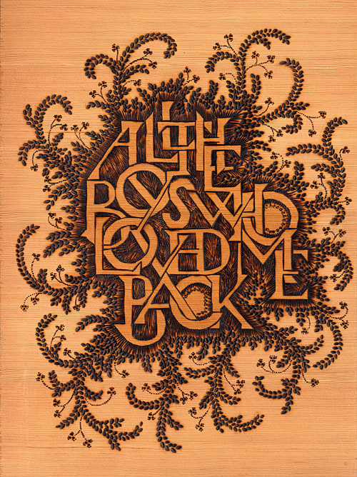
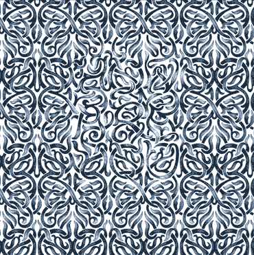
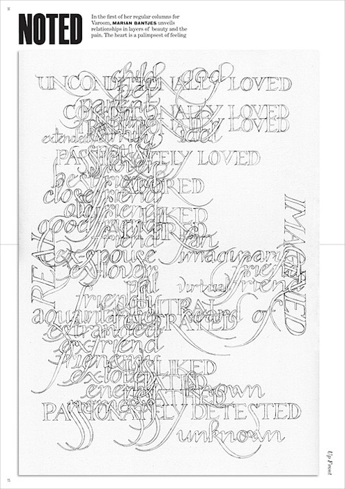
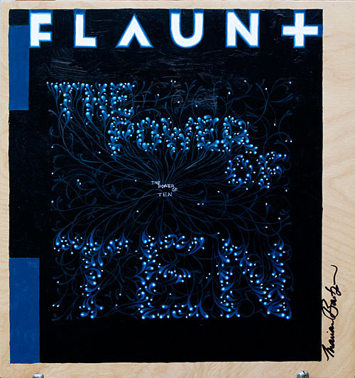
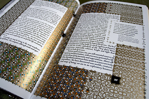
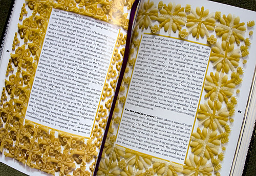
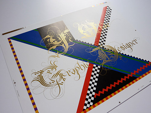
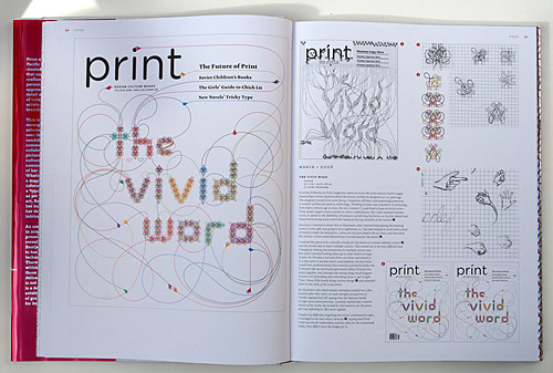
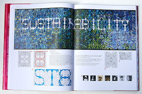
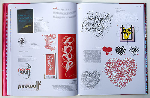
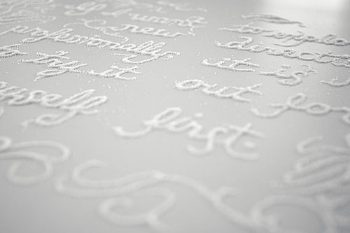
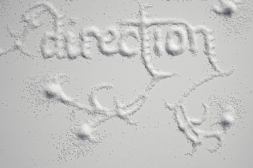
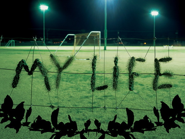
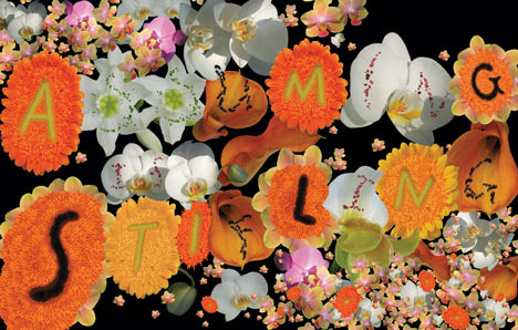
Marian Bantjes is known to be the main lettering maker on the planet not for quantity but precisely for quality of her works. She has perfected the field for many years using, not just a pencil and graphic editor, but also a number of inappropriate items. When selecting surfaces, she is not too modest because she is able to paint by powdered sugar right on a carrot cake and just a finger on a frozen glass, on flower petals by needles and wooden worktop by soldering tool.
After nearly ten-year management of her own company, she stopped earning money for being engaged in salutary lettering. Now she lives in the privacy of a tiny unnamed island on the west coast of Canada. She visits the mainland from time to time just to give a master class or talk to students, participates in collaborations with largest U.S. and European studios like Droog. And she is in the correspondence with the main designers on the planet; these lucky men are occasionally gifted paper letters with handmade drawings by her.
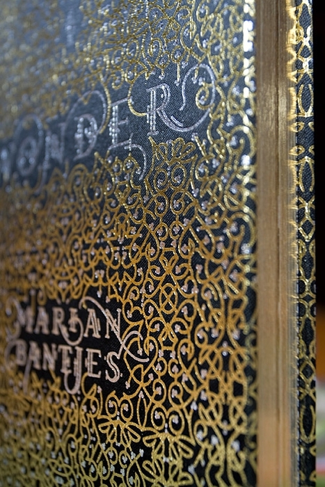
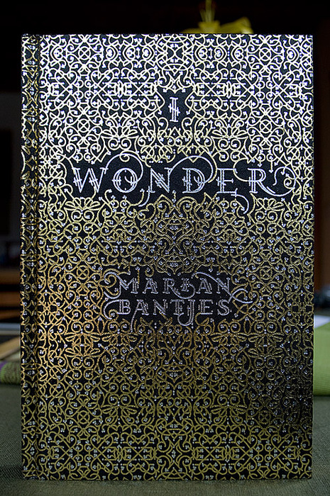
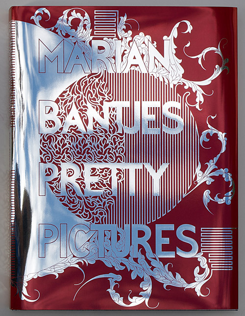
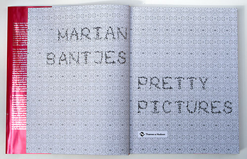
It would be dishonorable not to notice that only some live such a blissful professional life in this narrow field, but most have to earn money by «black» designer’s labour having set aside drawing letters for the evening. That is why Bantjes’ experience is doubly valuable. In 2010 she had her first book I wonder published it comprised her own illustrations. Furthermore, it is a highly talented sample of literature so the author is a Doctor of Humanities; her book is an art artifact which is impossible to leave hold of. There is nothing surprising about the fact that many of her works have already been misappropriated by the largest design museums in the world. The second book called Pretty Pictures has recently been published, it is a monograph of Bantjes’ works, and thus extremely recommended to have.
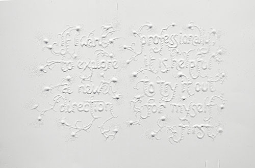
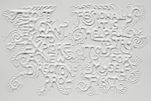
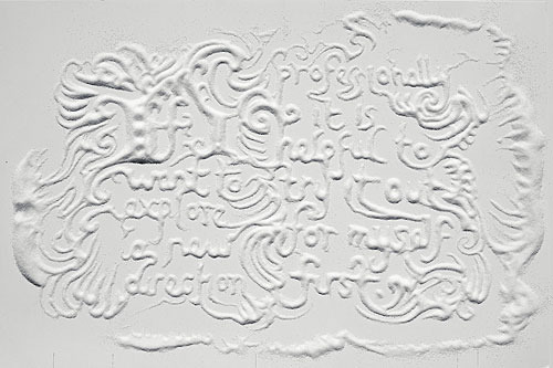
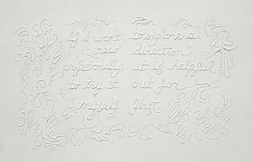
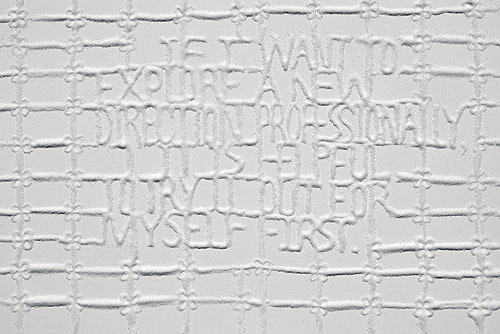
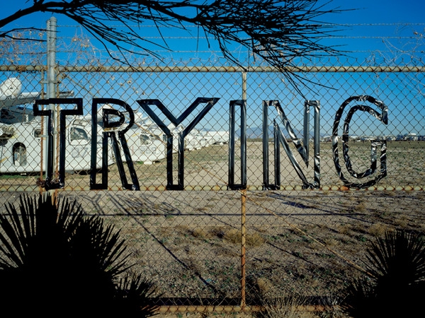
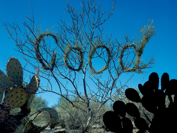
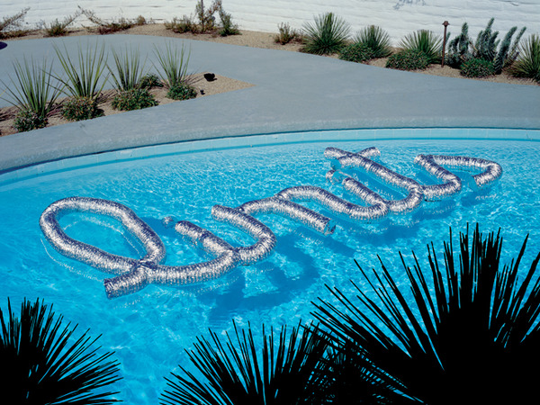
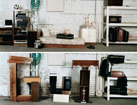
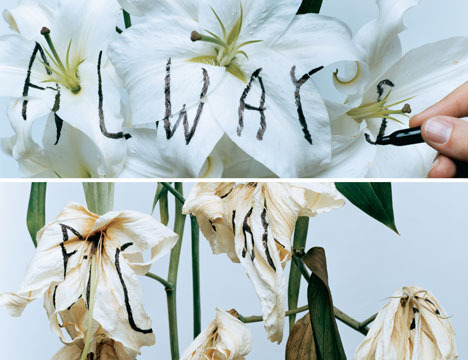
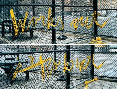
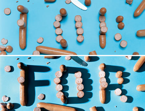
One of the most interesting Bantjes’ works is — “sugar” series special for Stefan Sagmeister – Things I Have Learned In My Life So Far:
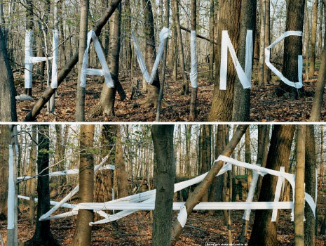
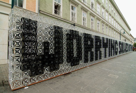
In general Sagmeister not being a lettering maker has done a lot for development of the field by only one project and also demonstrated a special skill letting to tame the client. It was like this: in 2006 Sagmeister taking advantage of his stellar reputation and partly black magic, persuaded bookers to give their advertising surfaces as a ground for his personal art-project (at the same time the client’s logo in the lower right corner remained). He took phrases from his personal diary and folded lettering of varying degrees of insanity in different parts of the world.
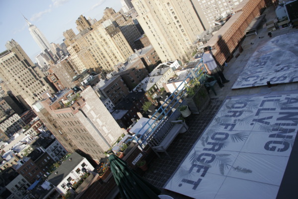
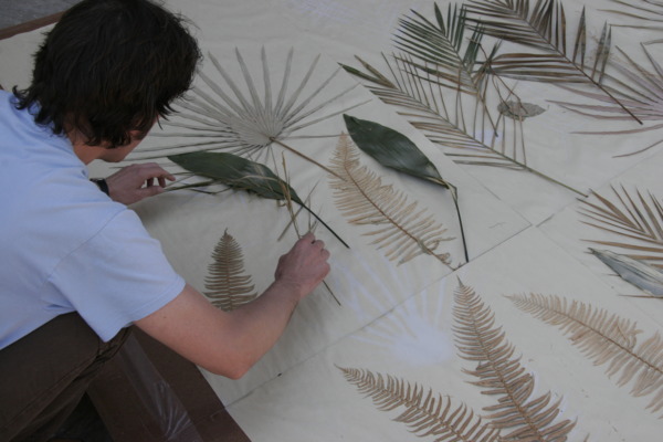
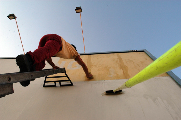
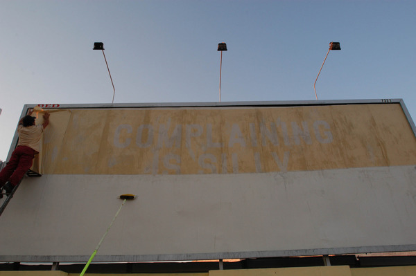
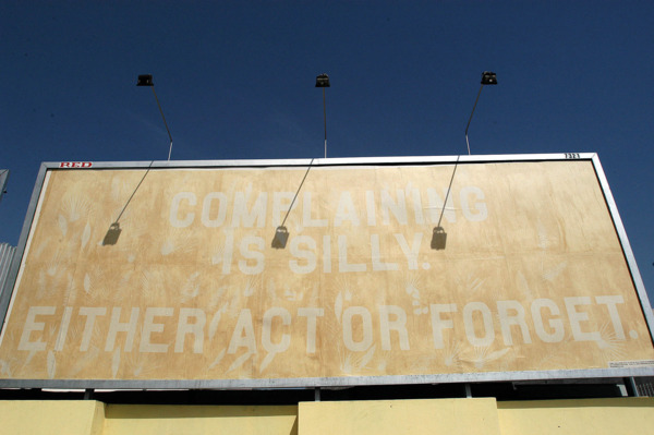
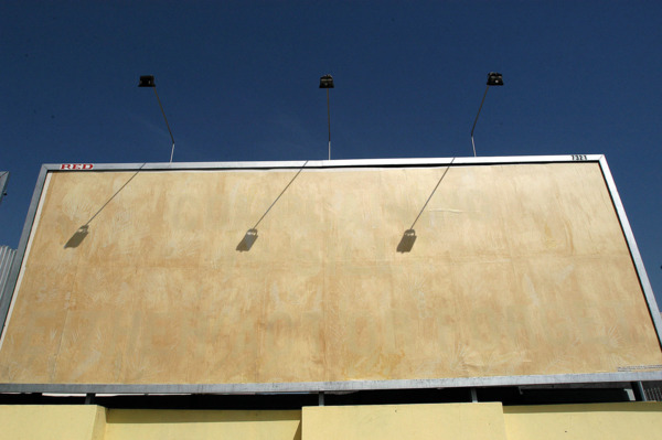
Each work of this series has its own story. Lisbon billboard, for instance, was made by Stefan and the company manually on the New York roof. Lettering lined by cardboard, said: “Complaining is silly. Either act or forget” had been a week under the sun and then sent to Portugal. “Billboard was hung on the sunny side of the street. Lettering was easily read in the first day but three days later it was beginning to fade and a week later in Lisbon no one complained” – told Sagmeister.
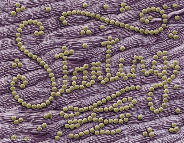
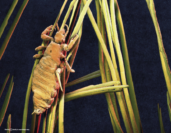
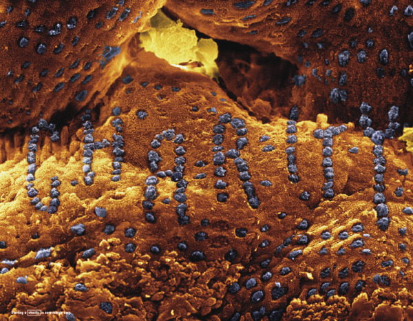
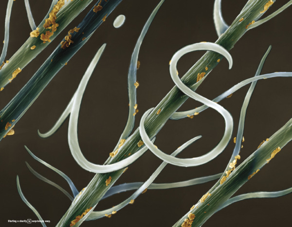
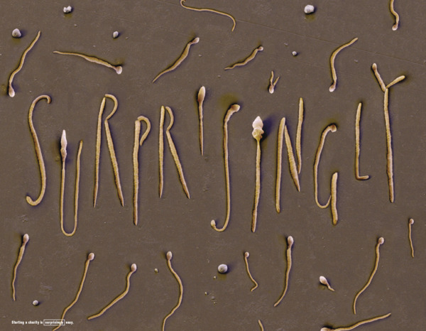
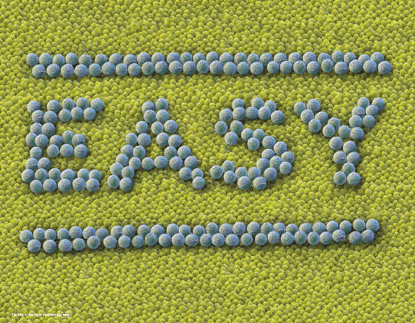
Here is lettering under the microscope – “Starting a charity is surprisingly easy”.
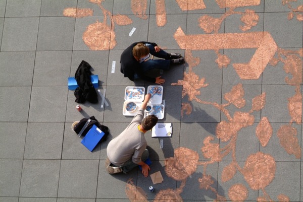
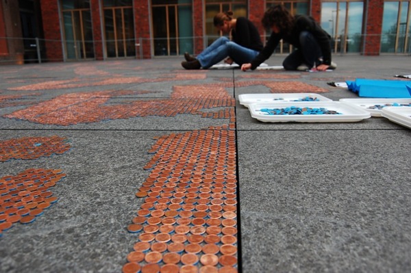
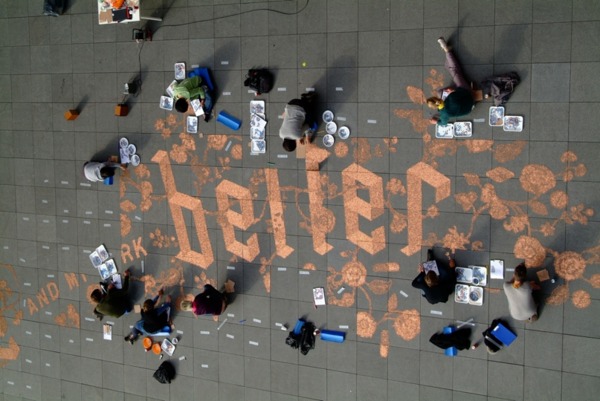
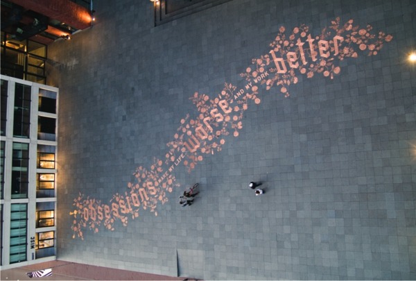
And the lettering lined by 650,000 euro cents on the square of Amsterdam (the most part of them was misappropriated by the local inhabitants) – “Obsessions make my life worse and my work better”.
The rest works of this series you can see on the web site of Sagmeister & Walsh studio.
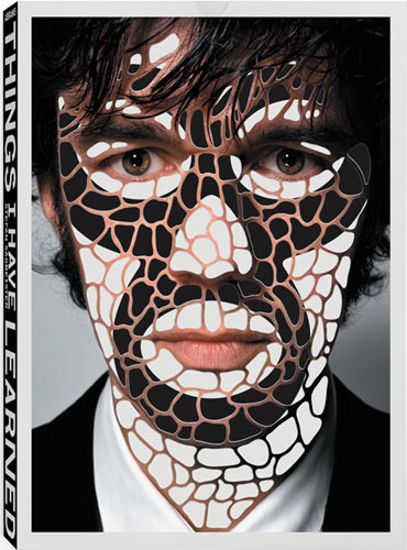
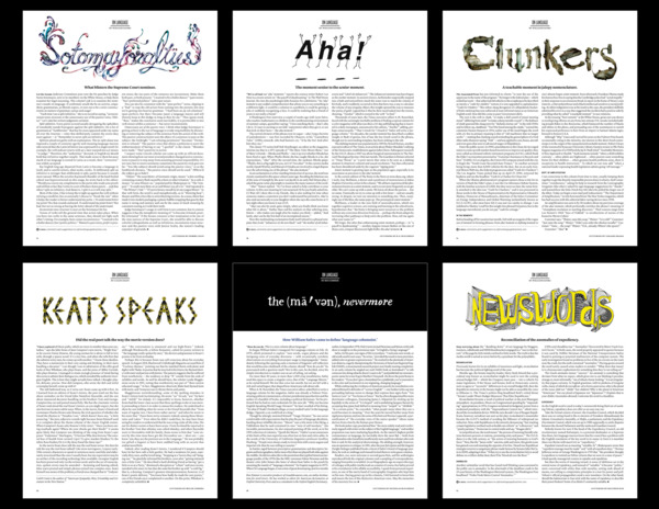
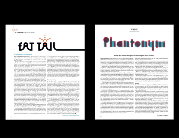
Another man successively engaged in popularizing of lettering is an art director of The New York Times, Arem Duplessis. His invaluable contribution to this business can be watched weekly in the category of On Language decorated by new illustrators in every edition. For more than three hundred editions NYT has never managed to be repeated but succeeded in presenting lots of beautiful lettering.
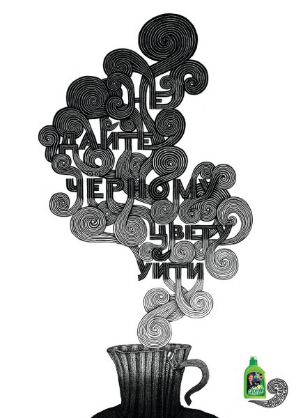
And yet nowhere else but advertisements have lots of lettering. One of beautiful Russian cases is a project collaboratively painted by the illustrators like Evgeny Tonkonogy (Bang!Bang! Studio) and chirographists Oleg Matsuev and Katerina Kochkina at the request of Leo Burnett Moscow:
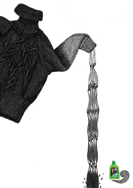
Lettering works belonged to another illustrator of Bang! Bang! Igor Mustafaev:
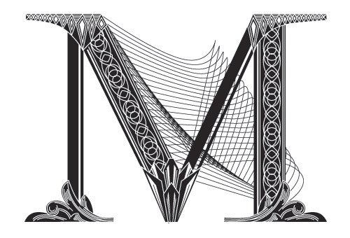
And a few names of foreign authors are worth saying about if we talk about lettering:
Lettering vs Calligraphy (Martin Flor feat. Giuseppe Salerno)
