Статья
Finnish wisdom
01/23/2013
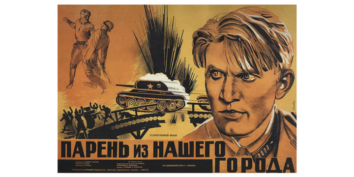
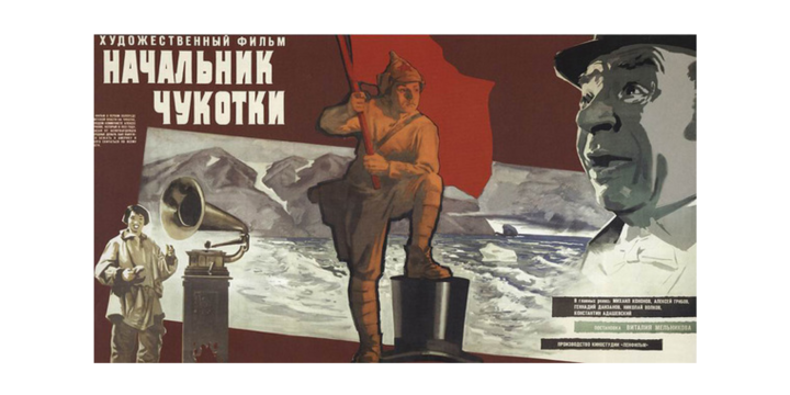
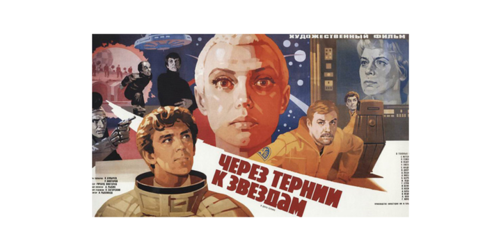
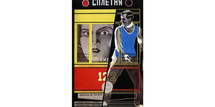
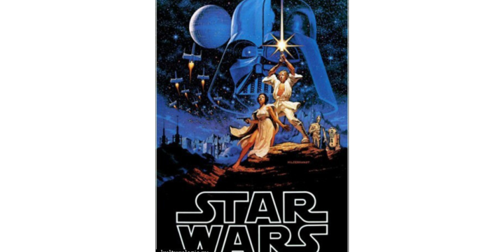
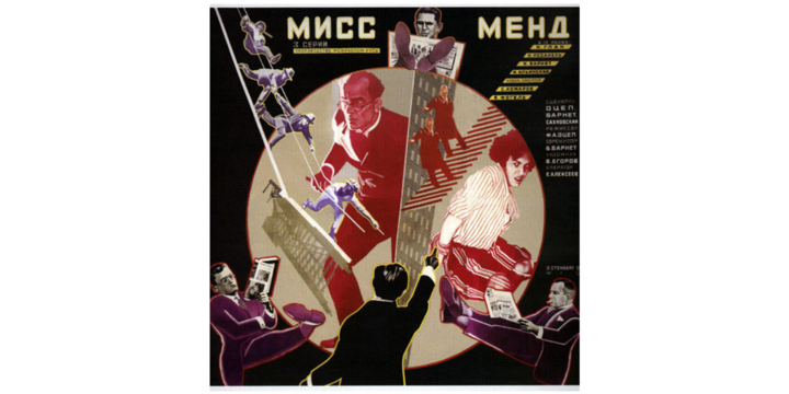
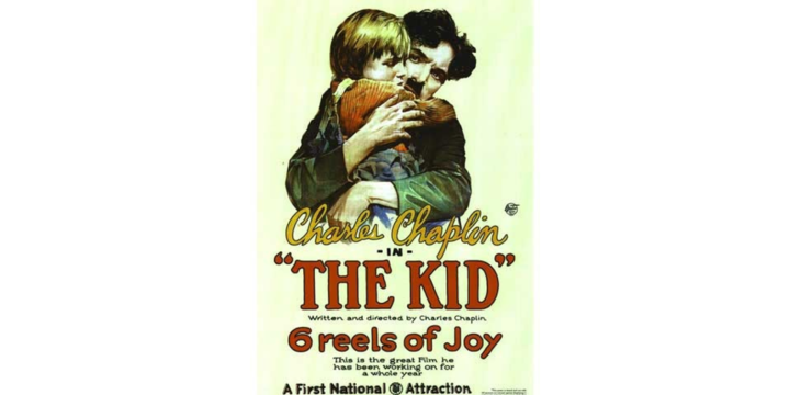
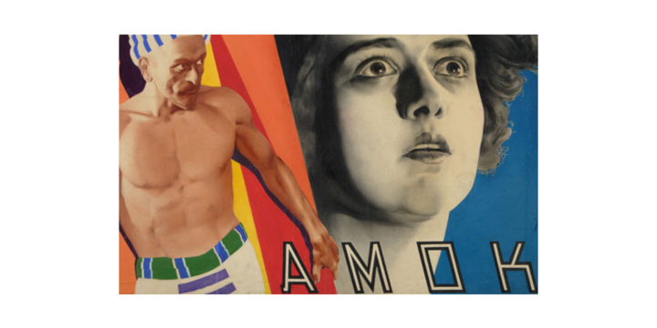
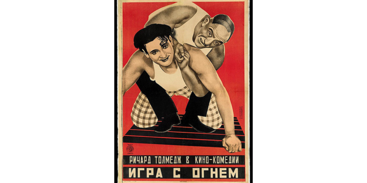
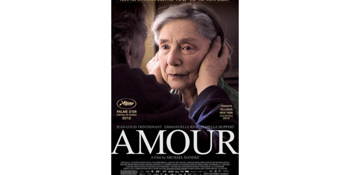
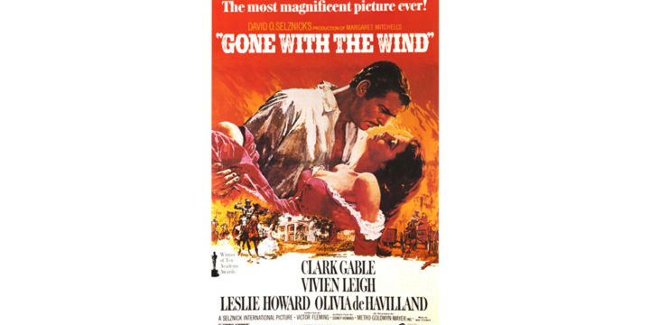
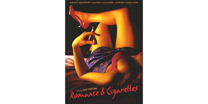
Modern movie posters are often blamed for their primitiveness and close similarity. The critics often contrast them with designers’ favorite ones from the cool posters collections: something Polish or Hollywood, some constructivism. How to differ a good poster from an ordinary one off the cuff? You shoud fancy it in a designer’s bedroom. If it’s ok — the poster is really awesome. And if the image refers to the crush-room full of cardboard Jacks Sparrow — it sucks.
But, with all due respect for the history, we don’t need movie posters to be separate kind of art. Maybe we used to need them, or was it just a random époque of fun in the process of evolution: those who’ve visited paleontological museum know the joy of observation incredible skulls of the dead creatures. The tradition of using animation and the limits of design and printing art of the period, creativity and the true interest in cinema, visual fashion and the system of distribution — you can dream the whole thing up when think of the parameters which influenced the movie poster.
One can hardly find a reason to be unsatisfied with the modern posters (except for the type). Why on earth do we need them? They help sell a movie, entice the watchers into going to the movies.
The same answer we’ve got from Gor Kirakosyan, a director who was asked some questions about key-art. But he said that they’re not posters but trailers that make a blockbuster.
When we had no trailers, we had advertising in movie theatres. And the most popular way to make a movie poster is to make a sort of trailer of it, to show us a statical movie. This approach has always been wery popular even with those artists whose works could be the gem of one’s bedroom collection.
When there would be some sort of electronic paper of holograms it goes without saying we should see it in movie advertising.
Movie posters designers have almost given up using stylization in favor of photorealism, hyperrealism, to make it as closer to a shot as possible. The obsession with realism and the pursuit of resolution has become a cultural-ideological trend with retina displays of i-pads, digital and three dimension movies and 48 frames per second “Hobbit”.
The movie industry strives for a better picture. The poster makers just try to be as close as possible to the present and future. If they could use the Photoshop earlier – they would do it.
On the other hand, there should be some reasons not to use the precious picture from the movie but to take a different one. We are speaking of someone’s great talent in design or someone’s personal courage or someone’s couldn’t-care-less attitude.
Not using independent graphics can be considered to be an easy and safe way of poster-making when you lack a talented designer and good material. 90 per cent of the posters seem to have been done in this way. But it has nothing to do with the technique used.
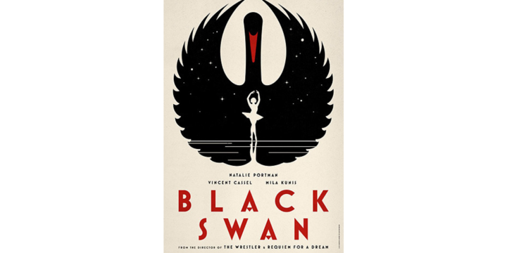
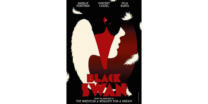
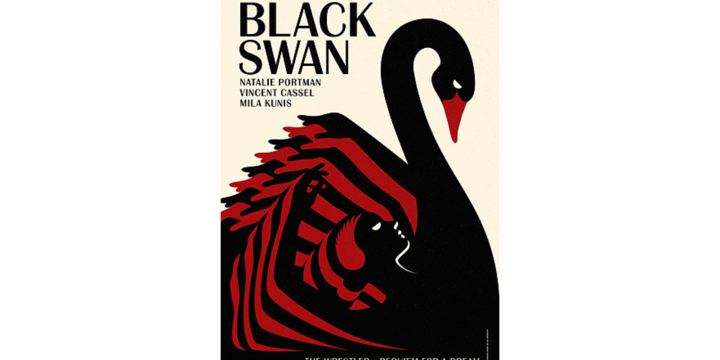
There is a poster for “Black swan” movie. In addition to the mainstream poster with the close up of the character’s face and the name of the movie on it they have made a number of different ones with contrast graphics, visual metaphors and beautiful prints. However, the poster with face is better.
That is to say, we just lack talented designers. And love, for sure. There’s a Finnish saying: like rider, like deer.
