Статья
Eye Review
04/18/2013
Last summer we left the office to take a slow short stroll and to take pictures of what we call “pictures” and what we see every day over and over again. Then we came back to the office.
Last summer we left the office to take a slow short stroll and to take pictures of what we call “pictures” and what we see every day over and over again. Then we came back to the office.
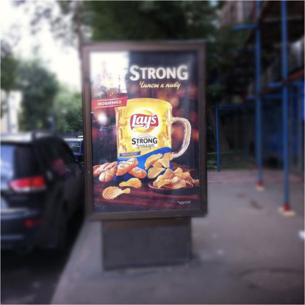
Natasha: That is grand. Poltergeist and flying chips.
Olya: It’s quite typical when they combine product and taste. That’s a popular approach to advertising: if there is strawberry flavored tea they draw a strawberry with a teapot’s spout.
Polina: Isn’t it cool when everything is clear: they make beer that tastes like cheese and chips, and there’s a new creative meaning of the word “strong”.
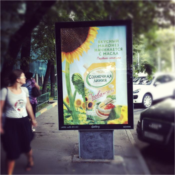
N: Long live the photorealism.
Tanya: Well, I object to such a realistic advertisement of mayonnaise in summer. The mayonnaise producers should use something more abstract: a tanned woman perhaps.
N: A fat tanned woman.
O: That’s the advertisement of sunflower seeds. There’s poor mayonnaise hidden in lettuce and lush tasty seeds!
P: The other day they sent us a brief for the summer mayonnaise – there was a slogan written with it on a girl’s belly. No more mayonnaise for me anymore.
T: Profit!
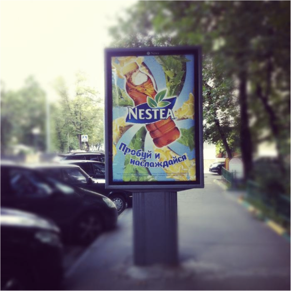
N: Everytime.
T: I don’t find it a good idea to cover a half of the picture with a slogan. So many details are hidden.
O: A psychedelic one. You can stand in front of it turning your head around – it’s such an attraction.
P: I got angry with this lazy kind of creativity. I guess it’s the effect of psychedelic.
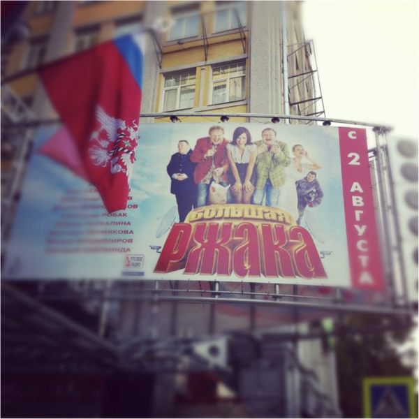
N: Gosh. Have you shrunk? I have.
T: They are all cannibals. And the word “roar” looks as if it was a jelly made of blood.
O: That is scary. Such a nightmare.
P: Laughter for the youth. You get the information about the movie budget with the help of such posters.
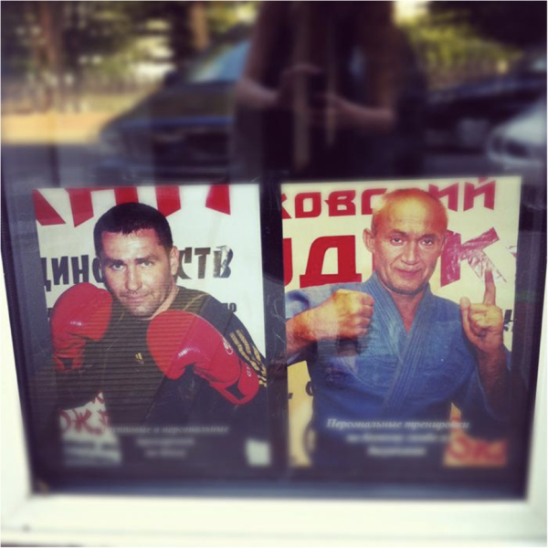
N: Oh yeah! Once again!
T: Why not, they’re steady guys.
N: I’m sure they can’t draw.
O: Cool strong guys. No comments.
P: Wait, there is another meaning. That’s the language of gestures! A fist is for “A” and a thumb up stands for “D”.
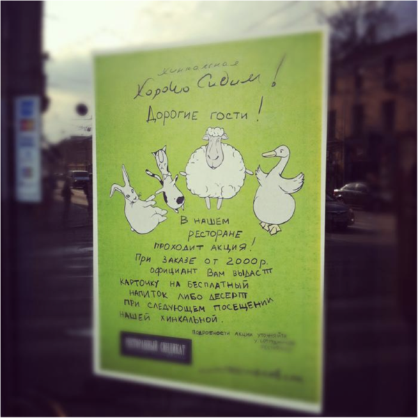
T: It it better. I don’t know why the second word starts with a capital letter though – are they initials? However, let it be.
O: The picture is ok although I have no idea why it is here.
P: Well, one can eat a goose, a rabbit, some mutton… But do they really serve cats?

T: I think here’s something beautiful but from here it looks as if someone has just had been shot in head.
O: We should have come closer and taken a picture.
P: We should.
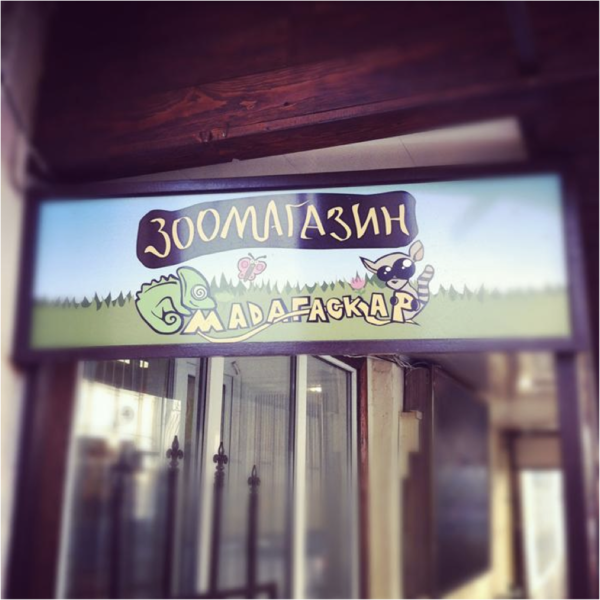
T: A very horrible signboard.
O: There is a belching little dragon and a surprised unidentified creature.
T: Let it be a cat.
P: A “Motherfuckup” pet store.
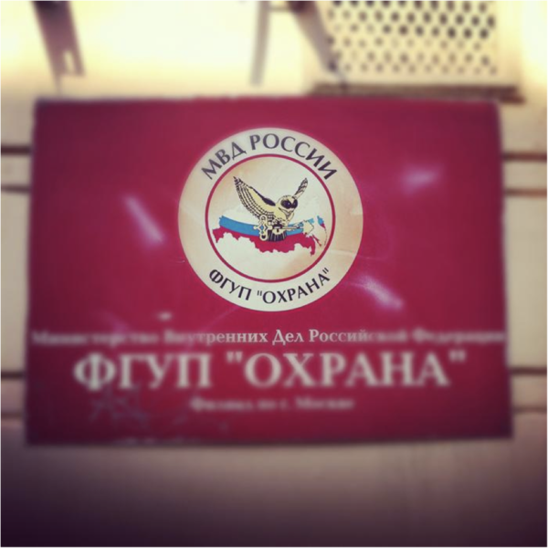
T: What a demonic badge. This owl has nothing to do with wisdom. I’ve looked it up and can tell you that an owl is a symbol of those who are in the know of some secrets. It’s a guide to the realm of shadows in Hinduism. And the Slavonic legends say it’s a demon, the herald of trouble. Isn’t it great? Welcome, Pelevin.
O: A symbol of absolute power. Is it from a fairy tale?
T: You’d better not deepen your interest. I say it’s too dark.
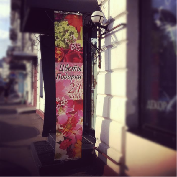
N: I’ve shivered again. It’s a pity there wasn’t enough space for the presents.
T: These are just flowers, why shivering?
O: Flowers and presents around the clock. There is nothing to add.
P: And nothing to seize on. Flowers 24 hours a day — it’s wonderful.
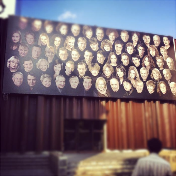
T: There is something archaic about it, ancestor’s sculls or oblation… Looks like staken off heads next to an old witch’s house.
O: Zombies are coming!
N: I have pity for the photographer, and the composition is a failure.
P: That’s a cool example of street-art. I like such things. You know, when people stop to take a photo of the thing — that’s a success.
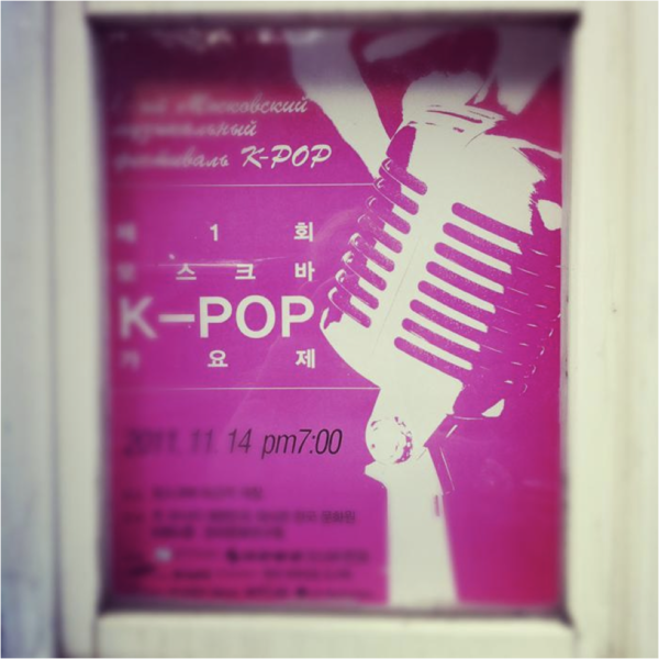
N: It’s ok
T: It’s only the color that is ok here.
N: That is the level!
P: You’ve blurred everything I could comment on. But the color is ok.
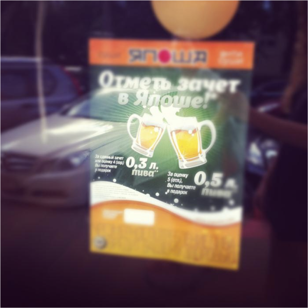
N: Boring.
T: Very boring.
P: That’s disappointment. Where’s a mug-shaped students’ record-book, where’s the student wearing a kimono and the very word “passed” made of sushi?
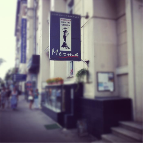
N: Well, that’s a dream.
T: If the signboard hadn’t been so new it would have looked like a Soviet one. However, it sucks.
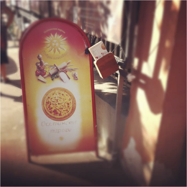
N: Ok…
T: I hate standers. They are usually cheap, shabby and ugly.
O: Is this really a pie or is it a magic button?
T: I wouldn’t touch it anyway.
P: The problem is this stander, the picture is ok. As well as the food there.
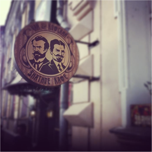
N: It’s ok, too.
T: I wish modern prints were prohibited.
P: The picture is ok. I have written a lot about the name itself, but then deleted.
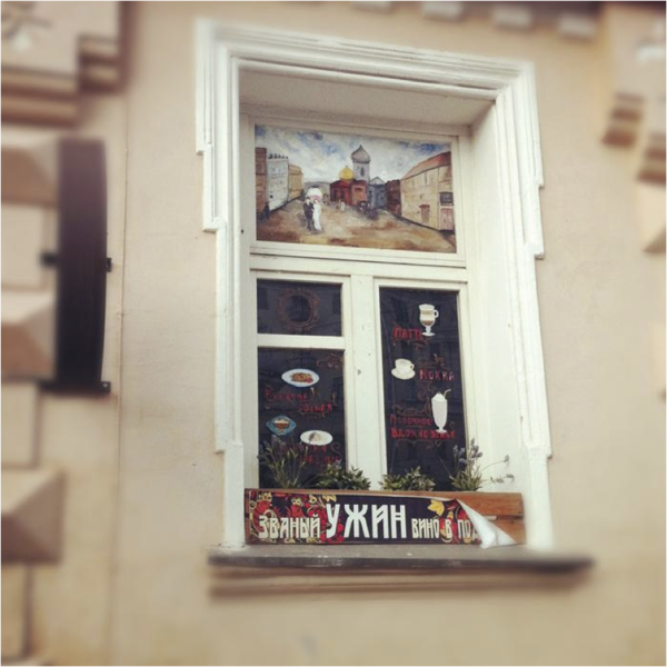
N: It’s so authentic.
T: No modern prints. But it’s nice to look at.
P: I really like the idea of pictured menu on the window.
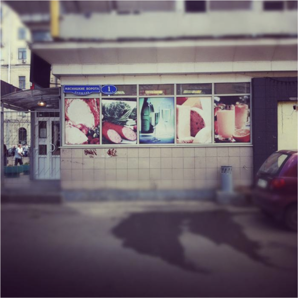
N: This is my Motherland.
T: I wonder where they all get the idea of such shop-windows from. There should be a source of such inspiration.
O: I am afraid if such huge photos of food. Please don’t.
T: SAUSAGE, CHEESE, MEAT.
P: And such posters always fade so fast! Come in, there is some blue meat for you!
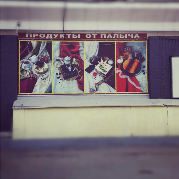
N: Aaaaaah!
T: A historical centre of the sity, romanticism.
O: Let Palych have them all himself.
P: Palych is sacred!
T: Polina seems to be Palych-addicted.
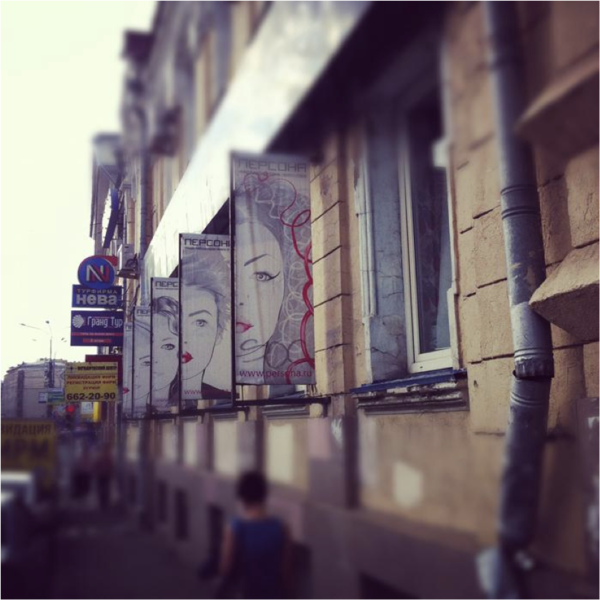
N: Where is the artist?
T: When “Persona” first appeared with these pictures, it was really cool. But years go by, and it’s time the illustrations were changed.
P: That’s it.

T: It’s all delicious when mixed. I don’t know why Russian tourists go to the Chinese parts of New York and San-Francisco, we have our own great style.