Статья
Writings On The Wall
01/21/2022
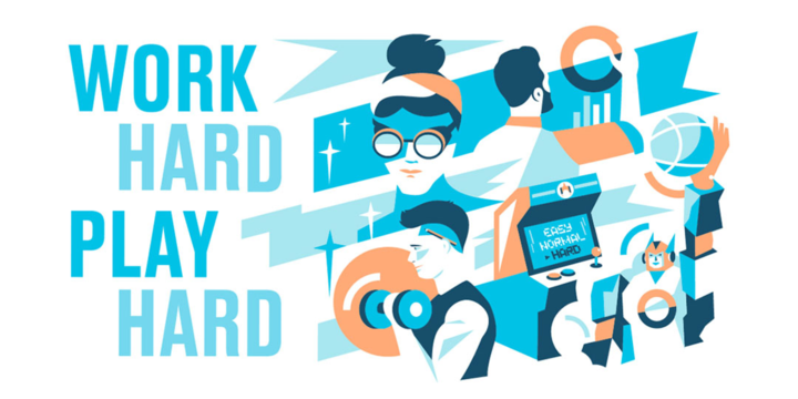
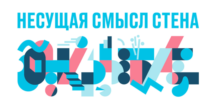
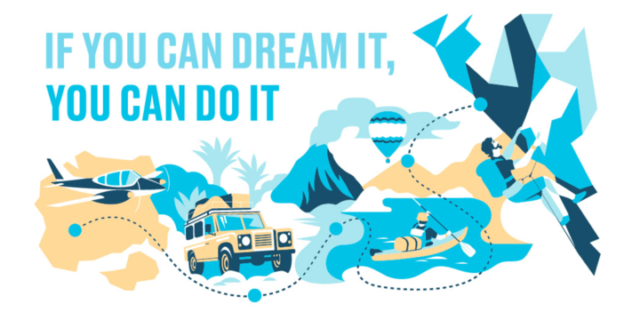
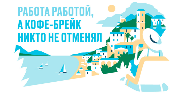
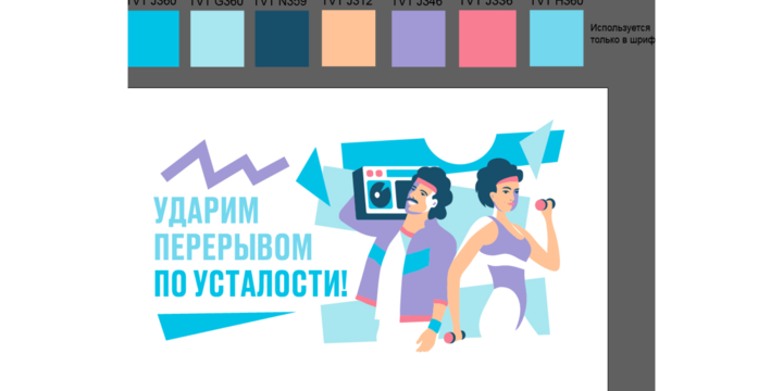
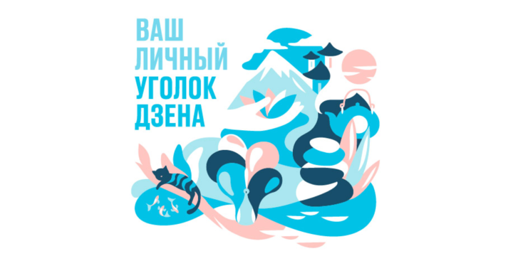
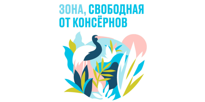
We always appreciated projects that could be recreated in real life. So this time we designed branded illustrations for walls of «Otkritie» bank break rooms.
Our main goal was to visually represent 34 motivational phrases. All of them were to be transferred to a wall via trafaret, so we had to be careful with choosing an illustrator for this job – this could not be a bitmap style project. We settled with Iv Orlov, who already had some background in working with graffiti and has a great sense of corporate identity.

It is easy to run out of ideas, while working on such a big project. First 5-10 sketches were easy to illustrate, but then Iv and Helena, our project manager, had to come up with references for certain plots and create a moodboard. Sometimes they had to spend hours on dribble in order to find perfect pictures. Choosing an easy way and using stock images simply wasn’t an option.
«Ideas came from the quotes. I had to visualise their meaning, and don’t overuse office workers in illustrations. All of them needed to be unique, with their own scenery, composition and color. Almost every work had a bunch of references: photographs, movie scenes, comics, album covers, posters, etc. «Achievers-territory» was one of the most challenging phrases to visualise. It was one of the first illustrations too, so it setted the overall graphic style», – tells Iv.
We had to learn a lot about technical aspects, since all of the illustrations were transferred on the wall via the contractor, instead of the artist. For example, the final picture was supposed to be easily divided into separate parts for easier transformation. All of the strokes needed to be connected and no lines could be crossed. If any of the files didn’t meet the requirement, they couldn't be transferred on the wall at all.
Luckily, bank management was very supportive. We were given creative freedom, since none of the sketches needed to be approved – we only had to present the finished work. After finishing the illustration pack, we matched the colors with a Tikkurila pallet for contractor’s use.
For Helena as a project manager, this project was truly special: «I was pleased to work with such a great team. Iv is a reliable and talented illustrator, who immediately «read» the corporate style and made a very first illustration without any sketches – it received very nice feedback. Otkritie bank has the best management that helped us throughout this project with everything, even when our strength was running out. I’m thankful to Ylia and Dasha for the help, it is very important.
It was «Otkritie»’s first time working in such a field: «Before starting this project, we had a creative competition with a couple of contractors, where we compared different artists’ work. With Bang! Bang! we got originality – Iv’s unique artist vision and style, that met our expectations. It is interesting how the artist combined his own manner of using bright spots with the bank's brandbook and strict system of dominance of one tone.
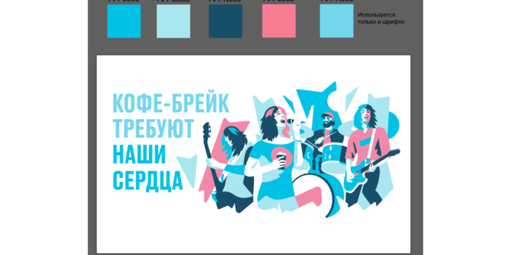
Our favourite illustrations represent the company's corporate policy very well. There are quite specific meanings behind each illustration – they determine the ways of achieving the company's overall goals and form a behavior model for each employee. It’s not only about motivational and ambitious goals, but also about care. Our favourite illustrations are about taking time to relax, and «work is work, but there is always time for a coffee-break» – is one of them».
Bang! Bang! continues to bring art to the walls outside of the digital space, so if you have objects to decorate, we are always ready! Contact us at bang@bangbangstudio.ru
